Technical Analysis For Beginners (The Ultimate Guide)
BySteve Burns
JUL 24, 2022Technical analysis is the art and science of reading charts to quantify the trend or trading range price is in, the path of least resistance for the next directional move, the area of value on the chart, and create good risk/reward ratios by defining key technical levels.
There are two major schools of thought within technical analysis: predictive technical analysis and reactive technical analysis.
- Drawing Tools
- Candlestick patterns
- Chart Patterns
- Technical Indicators
A trader must understand the purpose each tool is used for so they are implemented correctly.
How are drawing tools used in trading?
Most charting platforms have drawing tools that allow a trader to draw their own trendlines directly on a chart and create trend channels to track the momentum of a trend, with peaks (or highs) frequently respecting the upper trend channel; and troughs (or lows) respecting the lower channel.
A trader can project Fibonacci extension levels from a present trend and also project Fibonacci retracement levels from an existing trend.
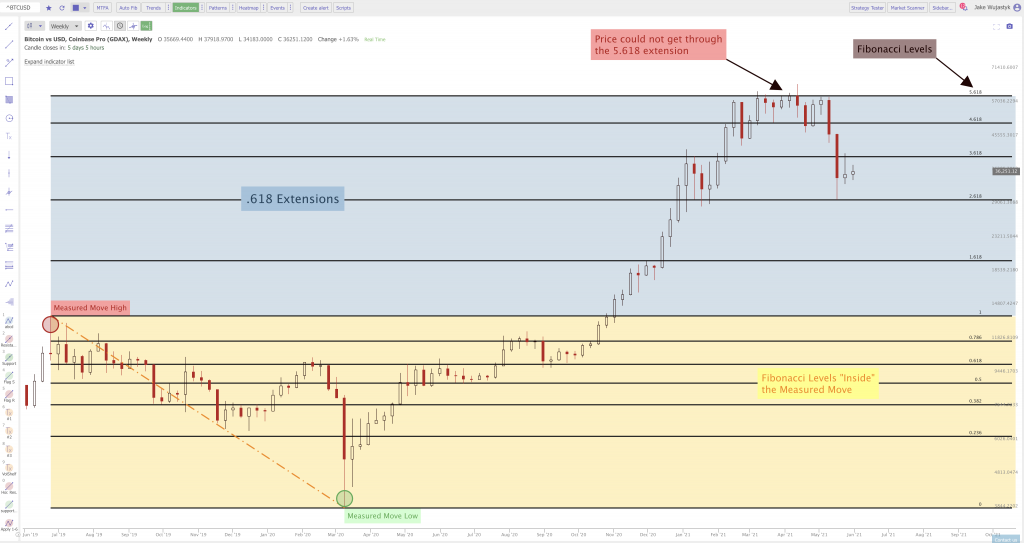
Image Courtesy of TrendSpider.com
Drawing tools also allow the creation of captions to highlight buy and sell signals and record your observations on the chart.
Trendlines are the identifiers and connectors of resistance and support in chart patterns.
Trendlines are ways to measure and quantify the path of least resistance for a chart in your time frame.
Trendlines are identifiers of the trend in your trading time frame.
Vertical trend lines must be drawn from left to right to identify one of the following:
A trend of higher highs signaling an uptrend.
A trend of higher lows for support in an uptrend.
A trend of lower lows signaling a downtrend.
A trend of lower highs for resistance in a downtrend.
Horizontal trend lines must be drawn straight from left to right to identify price levels of resistance based on repeating high prices that can’t be broken or levels of support based on repeating lows that hold.
Trend lines can connect end of day prices or the full daily range of prices. For candlestick charts the wicks represent intra-day prices that were outside the open or the close. Both are viable options for trend lines.
Trend lines should connect at least two price levels in a direct path to be considered viable. The more connections that a trend line makes the more meaningful it is.
Trend lines must be updated daily to ensure a trend is still in place. You want to see a connection and trend of prices in your timeframe.
A break out of price through your connecting trend line can indicate the beginning of a change in trend or market environment. A market could be going from an uptrend or downtrend to a sideways range as your trend line breaks or reversing in trend completely.
The vertical red lines on this chart represents the two downtrends that $XLE went through for weeks making lower highs day after day for much of the downtrend.
The green lines on the $XLE chart represent vertical support of higher lows as $XLE trends up twice on this chart. Notice that the red downtrend line was broken both times before the next uptrend began.

Chart courtesy of StockCharts.com
Chart Summary: Trendlines are visual ways to measure, identify, and track the trends on a chart by connecting vertical or horizontal support and resistance on a chart.
Price channels can be: up, down, or sideways.
There are uptrend, downtrend, and range bound price channels.
Here is an example of an up trending price channel:

Chart Courtesy of TrendSpider.com.
Here is what a range bound trading channel looks like:

Many times after a break out of resistance, old resistance can become new support: (Or vice versa).

Image via ColibriTrader.com
Chart Facts:
- A trading channel can be vertical or horizontal and is defined by trendlines.
- Vertical ascending up trend channels is defined by parallel higher highs and higher lows.
- Vertical down trend channels are defined by parallel lower highs and lower lows.
- Horizontal descending trendlines are defined by parallel lines that have price resistance around the same area of a high price level and price support around a similar lower area of price.
- Resistance lines in a chart pattern is where buyers are absent at higher prices and selling pressure at those prices set in.
- Support lines in a chart pattern are where buyers step in to buy at a price level to prevent prices from going lower overcoming the selling pressure.
- Buyers and sellers are always equal in any trade the variance is in what price that the trade will take place.
- Many times when a horizontal price channel is broken higher the old resistance becomes the new support.
- Many times when a horizontal price channel is broken lower the old support becomes the new resistance.
- Channels are for identifying where buyers and sellers are located.
- Momentum and trend signals are given when a well defined price channel is broken.
- Another name for a horizontal price chart pattern is a rectangle. The break out of the range in either direction is the signal to enter a trade in the direction of the break.
This $SMH chart shows examples of three ascending channels during the uptrend in this chart. The lower trend lines held up well in real time tracking and connecting on this chart. The upper trend line continued to set higher highs which was bullish. You also want to see the lower ascending support line continue to set higher lows by the close each day to keep reconnecting your lower trend line for ascending support.
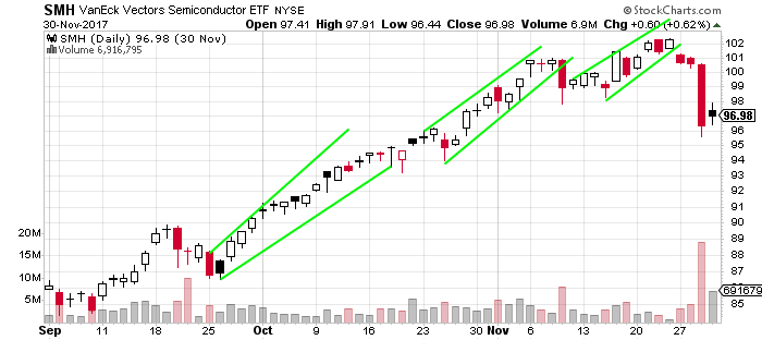
Chart Courtesy of StockCharts.com
This $PSX chart is an example of a reoccurring horizontal price channel for months. This is an example of a range bound market. The resistance is near $78.50 and support is near $74.50 to create a trading range. Notice that breakouts above and below these levels failed over and over. Returning to the previous price range after a failed break out is a sign of a range bound market. Trending market should have continuation after a break out is attempted several times. The best way to look for patterns of support and resistance is to look at where highs and lows of prices went to the last few times it made short term lows and highs in price.
Chart Courtesy of StockCharts.com
Chart Summary:
- In defined vertical price channels there are better odds of success in buying the direction of the channel.
- When trend lines connect higher highs and higher lows the best odds are on buying the dip in price to the lower trend line.
- When trend lines connect lower highs and lower lows the best odds are on selling rallies into the upper trend line.
- In horizontal price channels there are better odds of success in buying support and selling resistance.
What are the main candlestick patterns?
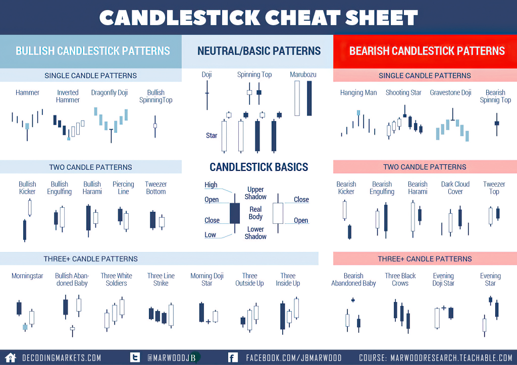
Image Courtesy of stocksoftresearch.com
A candlestick is a type of chart used in trading as a visual representation of past and current price action in specified timeframes.
A candlestick consists of the ‘body’ with an upper or lower ‘wick’ or ‘shadow’.
Most candlestick charts show a higher close than the open as represented by either a green or white candle with the opening price as the bottom of the candle and the closing price as the high of the candle. Also, most candlestick charts show a lower close than the open represented by either a red or black candle with the opening price as the top of the candle body and the closing price as the low of the candle body.
Price action that happens outside the opening and closing prices of the period are represented by the wicks or shadows above the body of each candle. Upper wicks represent price action that occured above the open and the closing prices and the lower wicks represent price action that occurred below the opening and closing prices.
Candlesticks are one type of chart that can be used in technical analysis to look for repeating patterns and in correlation with other technical indicators and signals.
Candlesticks are combined in many patterns to try to read the behavior of traders and investors in buying and selling to create good risk/reward setups for trading.
Candlestick charts have different settings. Candlesticks can be set to be green/red or they can be set as hollow candles. With the green/red settings the green candles occur when price closes higher than the previous close and red candles occur if price closes lower than the previous close.
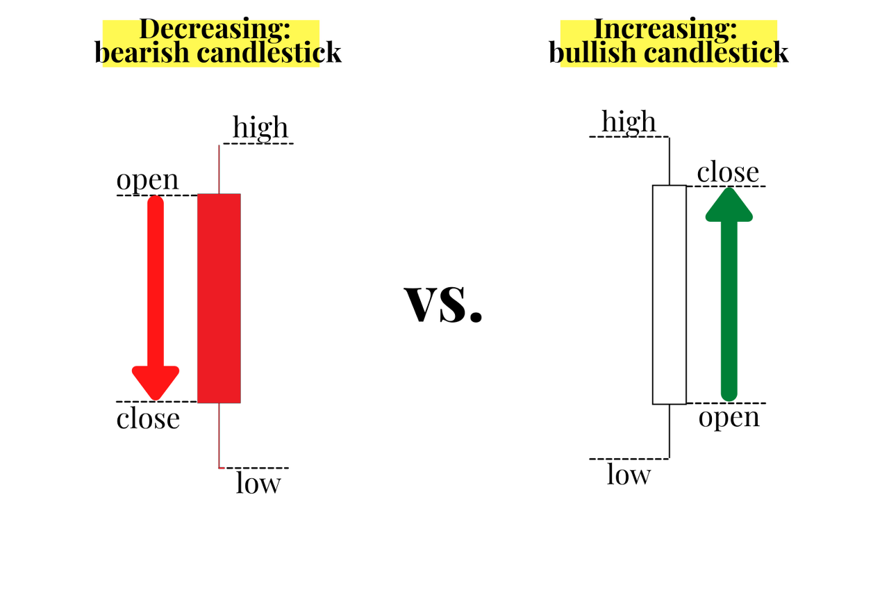
How to Read Hollow Candlesticks
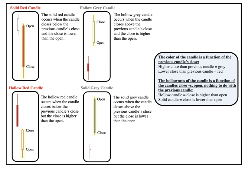
Hollow candlesticks are made up of four components in two groups. First, a close lower than the prior close gets a red candlestick and a higher close than the previous close gets a white candlestick. Second, a candlestick is hollow when the close is above the open and filled when the close is below the open. The following image shows the four possible hollow and filled candle combinations when using hollow candlestick chart settings.
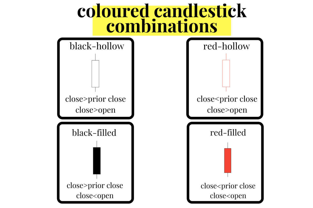
Red-hollow candlesticks can show some bullish reversal price action on an overall bearish chart. Even as the closing price was lower than the previous close making the candle red the price action moved higher during the period after the open making it hollow. Even though it closed lower than the previous trading period, there was buying pressure near the lows that made it close higher than the open.
The solid black or grey-candle is the inverse price action of the red-hollow candle. Even though the closing price was above the previous close making it black, price action did finish lower than the open to make it a black-filled candle. Even though a black-filled candle closes higher on the current period versus the previous period, it does show selling pressure after the opening price. This candle shows rejection of intraday highs and can be a standalone signal of a bearish reversal during an upswing or uptrend in price action especially near new highs in price.
There are four types of hollow candlesticks:
- Hollow candles occur when the price closed higher than it opened.
- Filled candles occur when the price closed lower than it opened.
- White candles occur when the price closed higher than the prior close.
- Red candles occur when the price closed lower than the prior close.
Note that white candles have black or grey outlines and will at times also be called hollow black candles or hollow grey candles.
Learning to read candlesticks quickly is like learning a type of technical trading language. With time and experience a trader can see what candles are showing about the current price action. A trader can start seeing the patterns that emerge from buyers and sellers shifting the price action around key technical price levels of resistance and support on a chart. In this book you will see bullish, bearish, and neutral candlestick chart patterns and it is important to take the signals that they give in the context of the bigger picture of the chart.
Bearish candlestick patterns will have better odds of success when they occur on a chart and have confluence with other bearish signals like overbought readings or a loss of key price support or an important moving average. The same applies with bullish candlestick patterns having better odds of success when they occur on a chart and have confluence with other bullish signals like oversold readings or breaking above a key price support or resistance area or retaking an important moving average.
Candlestick chart patterns show you the present not the future. They can be used to position traders for good odds of capturing the next direction of price movement by aligning them in the path of least resistance. Profitable trading can emerge from going with the current trend on a chart along with letting your winning trades run and cutting your losing trades short. Along with doing all this with proper position sizing and discipline. Let’s begin our journey into more complex candlestick patterns.
Bullish Candlestick Patterns
Bullish candlestick patterns on a chart visually show buying pressure. These patterns can show the possibility of a price reversal during a downtrend or the continuation of an uptrend already in place. There can be single bullish candles or bullish candlestick patterns containing multiple candles in row.
Here are some of the most popular bullish candlestick patterns with links to descriptions:
- Hammer
- Inverted Hammer
- Dragonfly Doji
- Bullish Spinning Top
- Bullish Kicker
- Bullish Engulfing
- Bullish Harami
- Piercing Line
- Tweezer Bottom
- Morning Star
- Bullish Abandoned Baby
- Three White Soldiers
Bullish candlestick patterns visually show the success of buyers to take a price higher and buying take control of a chart for the timeframe of the price action. These are bullish signals that need confirmation with an upswing in price after the pattern forms.
The meaning and value of bullish candlesticks must be considered taking into the context of a chart pattern and their confluence with other signals. A bullish candlestick pattern that happens when a chart is oversold could signal a reversal of a downtrend. Bullish candles that happen late in an uptrend after a long term run in price after a chart is already overbought can have a lower probability of success.
Bullish candlestick patterns that have a confluence with other systematic buying signals increase the odds of a trades success.
Bearish Candlestick Patterns
Bearish candlestick patterns on a chart visually show selling pressure. These patterns can show the possibility of a price reversal during an uptrend or the continuation of a downtrend already in place. There can be single bearish candles or bearish candlestick patterns containing multiple candles in row.
Here are some of the most popular bearish candlestick patterns with links to descriptions:
- Hanging Man
- Shooting Star
- Gravestone Doji
- Bearish Spinning Top
- Bearish Kicker
- Evening Star
- Bearish Engulfing
- Bearish Harami
- Dark Cloud Cover
- Tweezer Top
- Bearish Abandoned Baby
- Three Black Crows
- Evening Doji Star
- Evening Star
Bearish candlestick patterns visually show the failure of buyers to take a price higher and sellers take control of a chart for the timeframe of the price action. These are bearish signals that need confirmation with a down swing in price after the pattern forms.
The meaning and value of bearish candlesticks must be considered taking into the context of a chart pattern and their confluence with other signals. A bearish candlestick pattern that happens when a chart is overbought could signal a reversal of an uptrend. Bearish candles that happen late in a downtrend after a long term drop in price after a chart is already oversold can have a lower probability of success.
Bearish candlestick patterns that have a confluence with other systematic short selling signals increase the odds of trade success.
Types of chart patterns
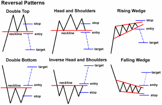
Chart patterns are visual representations of price action. Chart patterns can show trading ranges, swings, trends, and reversals in price action. The signal for buying and selling a chart pattern is usually a trend line breakout in one direction showing support or resistance is overcome at a key level. Stop losses are usually set on retracements back inside the previous range and profit targets are usually set based on the magnitude of the previous move leading into the pattern.
Many people think of chart patterns as bullish or bearish but there are really three main types of chart pattern groups: reversal chart patterns, continuation chart patterns, and bilateral chart patterns. Understanding the differences are important for traders to understand the path of least resistance on a specific chart based on the primary sentiment of the buyers and sellers price action.
Reversal Chart Patterns
Reversal patterns happen when a chart has a strong break from its current trend and its momentum reverses course. These patterns show that a trend is coming to an end and the price action is moving in a new direction away from the previous range or direction. These patterns go from bullish to bearish or bearish to bullish. They can take longer to develop than other types of chart patterns.
Continuation Chart Patterns
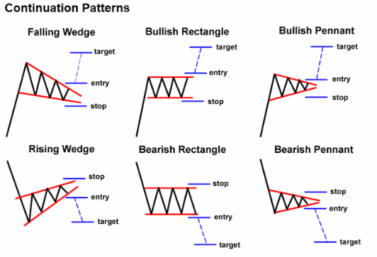
Continuation patterns signal that the current trend is still in place and it’s about to resume going in the same direction after a trading range has formed. These types of patterns usually form consolidations in price action to let buyers and sellers work through supply and demand before moving higher or lower like the previous trend leading into the range. These are the most popular classic bearish and bullish chart patterns.
Bilateral Chart Patterns
Bilateral patterns are neutral in movement and show that price can breakout in either direction. These are usually symmetrical price action ranges that show equal support and resistance trend lines as price consolidates there is no advantage seen by the buyers or sellers as the upper trend line declines and the lower trend line ascends equally. The previous trend in price before the triangle can many times also be unclear or has been a range as well. These types of charts are like Schrodinger’s patterns as they are both bullish and bearish until price breaks out in one direction showing which direction has an edge in the next trend.
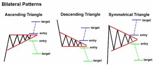
It is important to identify which type of chart pattern you are observing to key in on the right sentiment of buyers and sellers to understand the probabilities of the next directional move in price.
Chart patterns can also be defined by the overall trend as bullish or bearish. Bullish chart patterns have the path of least resistance to the upside while bearish charts path of least resistance is the downside.
Bullish Chart Patterns
- Double bottom
- Triple bottom
- Rounding bottom
- Diamond bottom
- Bullish Flag
- Bullish Pennant
- Cup with Handle
- Ascending Triangle
- Symmetrical Triangle
- Measure Move Up
- Ascending Scallop
- 3-Rising Valleys
Bearish Chart Patterns
- Double top
- Triple top
- Rounding top
- Rectangle top
- Head and Shoulders top
- Bearish Flag
- Bearish Pennant
- Inverted Cup with Handle
- Descending Triangle
- Rising Wedge
- Falling Wedge
- Descending Broadening Wedge
- Diamond
- Measured Move Down
- Descending Scallop
- Three Falling Peaks
- Island Reversal
What are the 4 types of indicators for technical analysis?
Trend Indicators
These indicators measure the direction of price action through quantifying uptrends and downtrends on a chart. They include moving averages and parabolic SAR.
Momentum Indicators
These indicators measure the magnitude and strength of movement of price action on a chart. They include the Stochastic Oscillator and the Relative Strength Index (RSI).
Volatility Indicators
These indicators quantify the size of the trading range on a chart. They include Bollinger Bands and Average True Range (ATR).
Volume Indicators
These indicators quantify the price action in correlation to the volume. They include On Balance Volume and Volume Rate of Change.
If you are ready to improve your trading game you can get a more in depth understanding of how to use technical analysis for profitable trading with my best selling trading books on Candlesticks, Chart Patterns, and Technical Analysis on Amazon here.
I have also created trading eCourses on my NewTraderUniversity.com website here. My educational resources can save you time in your trading journey. Learn from my 30 years of experience in the markets.
'거래기술에 관한 정보' 카테고리의 다른 글
| Wolfe Wave Patterns울프 웨이브 패턴 (0) | 2023.08.04 |
|---|---|
| Options Trading: Understanding Option Prices(옵션 가격 이해하기) (0) | 2022.08.25 |
| The Insane Story of the Greatest Trader of All Time (0) | 2022.07.18 |
| Trend Following Trading Strategy Guide (0) | 2022.07.16 |
| 5 Reasons Why Traders Lose Money (0) | 2022.07.15 |